Nidd View Sales

Overview

PROBLEM

Nidd View Sales needed a brand identity that reflected the uniqueness of their location and the personal approach behind their business. Situated overlooking the beautiful Nidderdale landscape, their existing identity needed to communicate the connection they had with their surroundings while creating a memorable and distinctive presence within the property market.

SOLUTION

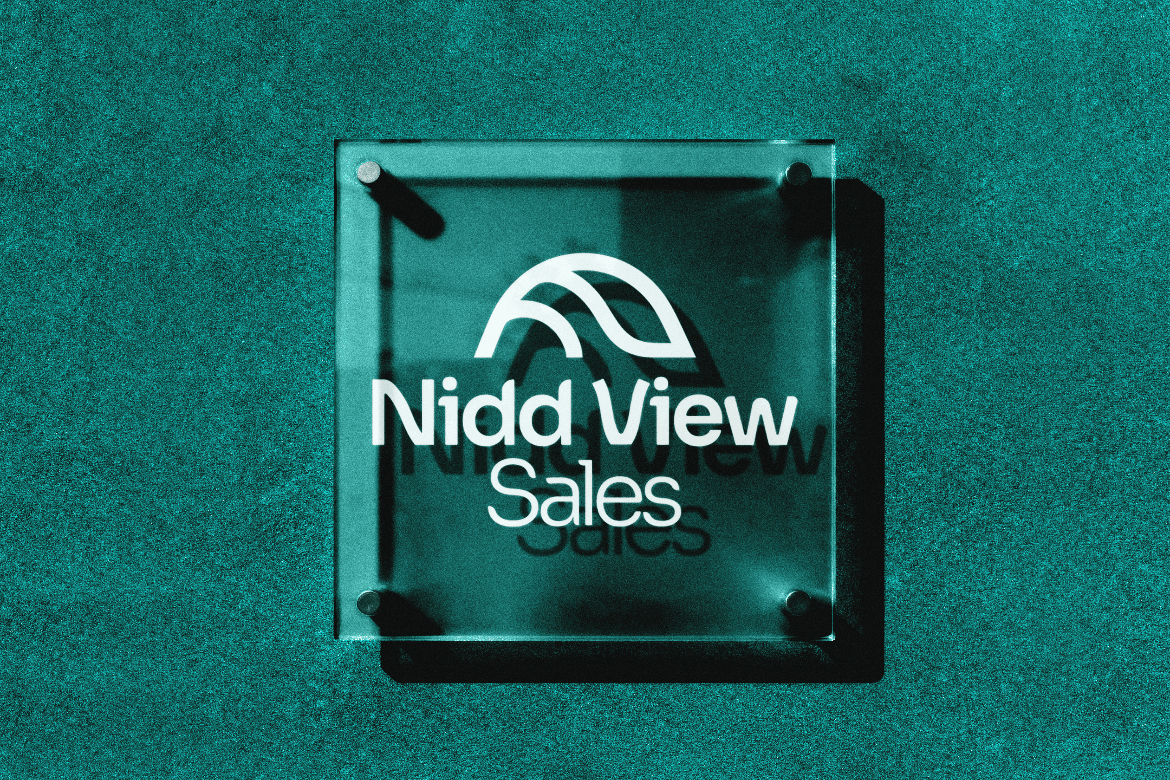
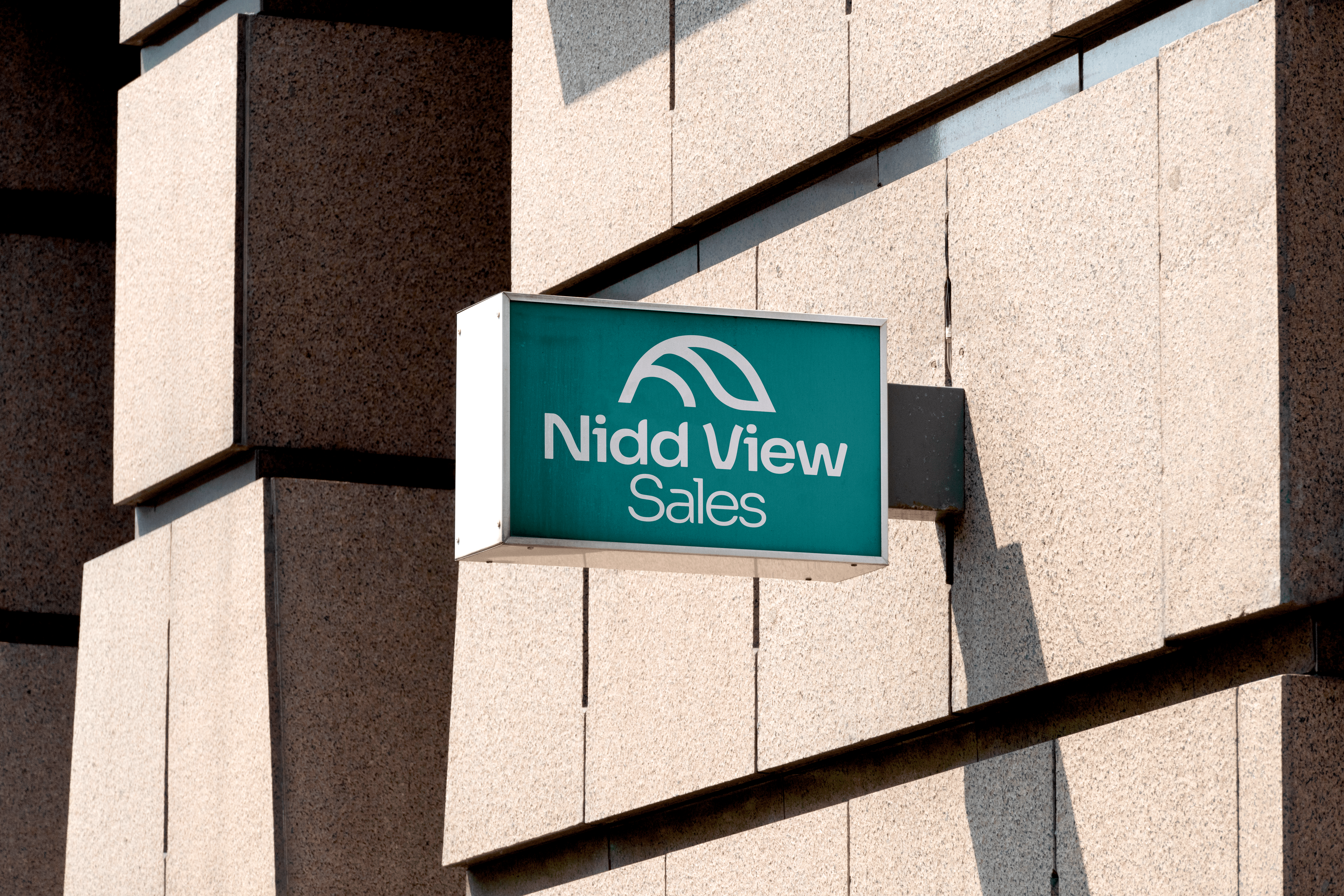
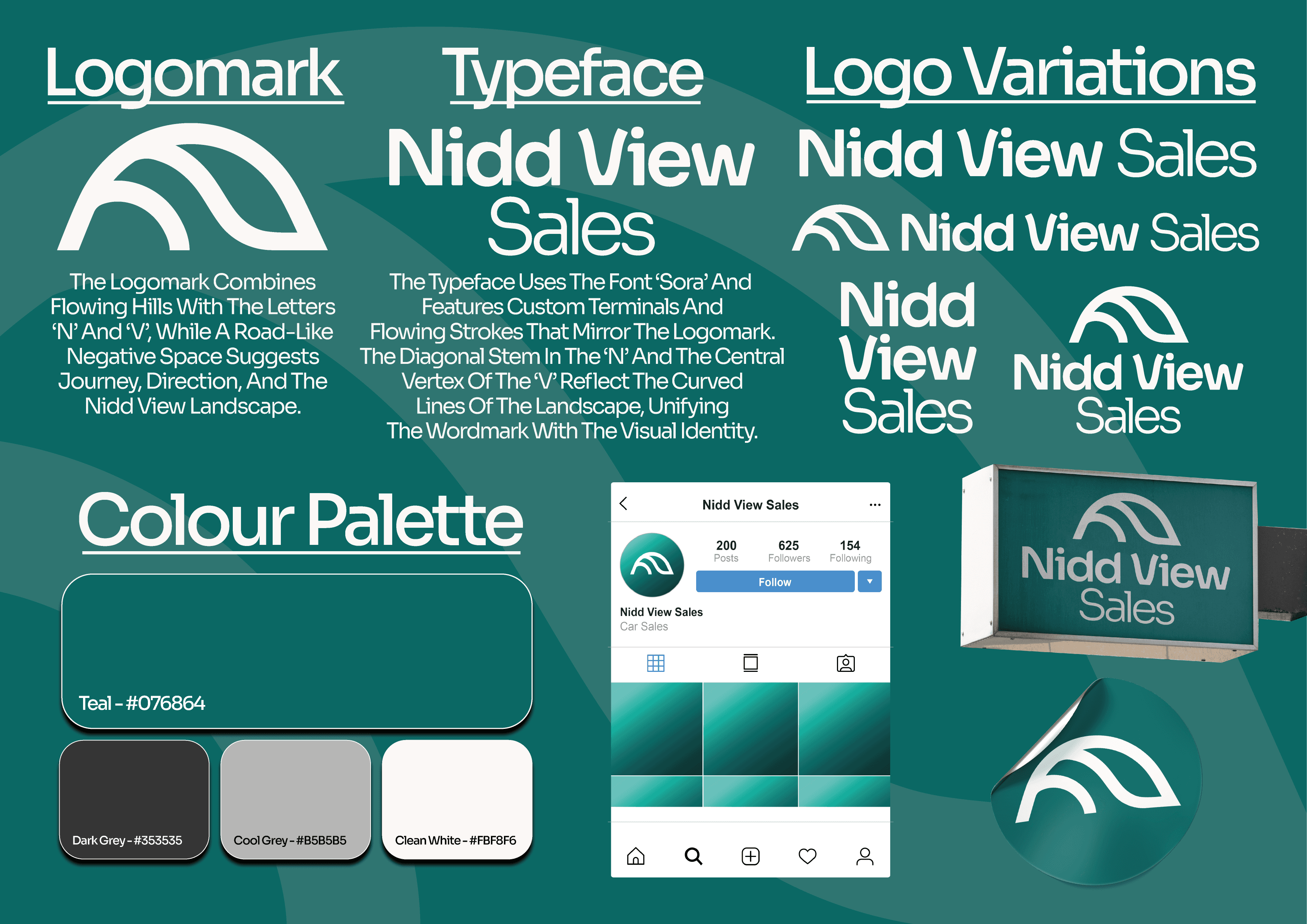
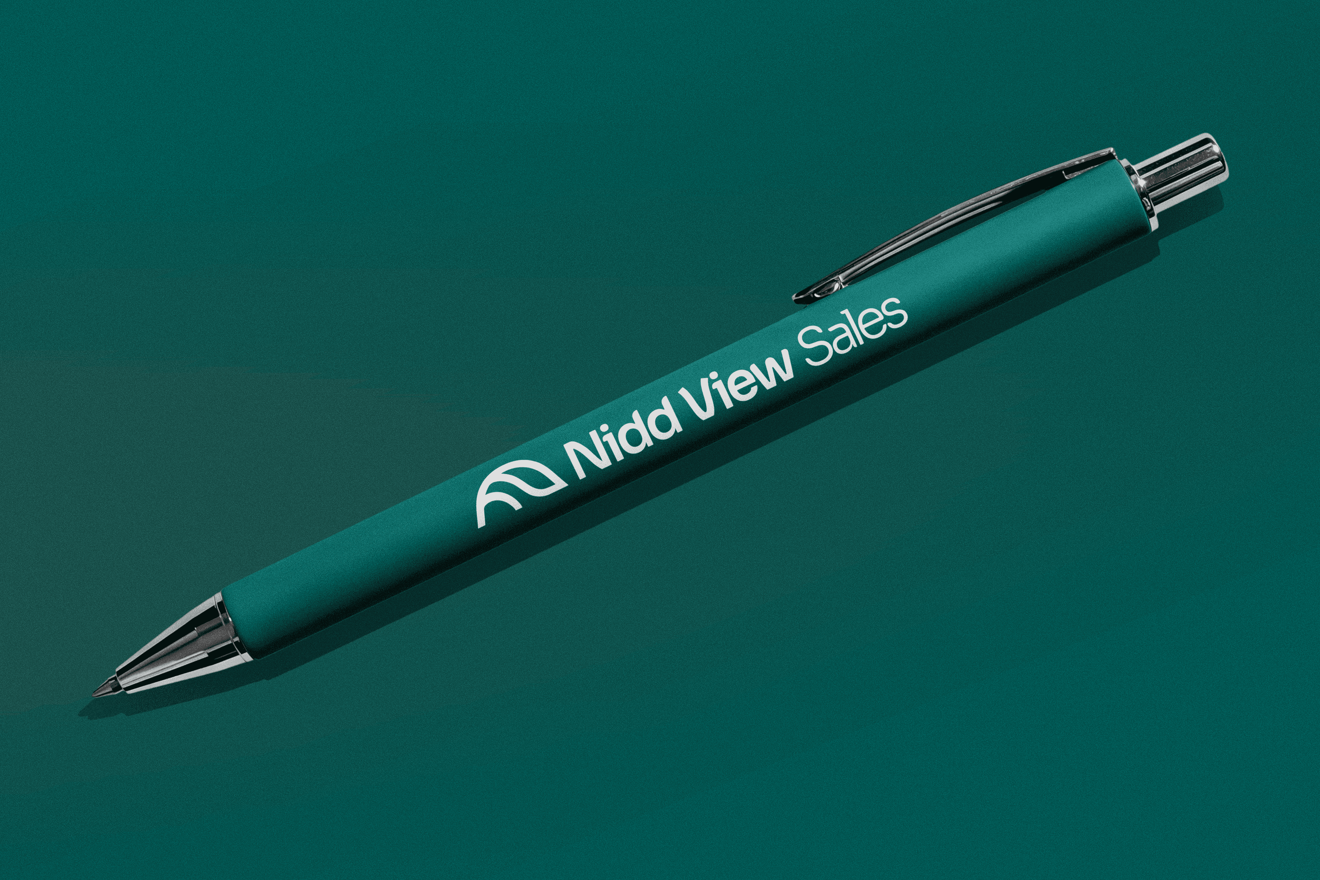
The brand identity was developed around the defining feature of Nidd View Sales; their incredible hillside location. The logo mark captures the shape of the surrounding landscape while subtly incorporating an ‘N’ and ‘V’ within the curves, creating a personal connection between the business name and its environment. These flowing forms were carried through into the typography, with the curves from the logomark influencing the letterforms to create a consistent and cohesive identity.


The primary teal colour combines the reliability and trust associated with blue with the freshness and natural qualities of green. This creates a modern and approachable tone for the brand while reflecting Nidd View Sales’ connection to the surrounding Nidderdale landscape.


Overall, the result is a brand that feels natural, refined and unique, reflecting both the character of Nidderdale and the personal service offered by Nidd View Sales.

Deliverables:

Deliverables:

Deliverables:

Branding

Logo Design

Art Direction

Year

/

2025

Client

/

Nidd View Sales
Next work