Origin

Overview

PROBLEM

Origin was created to challenge the way everyday spices and seasonings are perceived. The brand needed to stand out in a crowded market while communicating a sense of quality, natural ingredients and the journey behind where flavours come from. The challenge was creating an identity that felt approachable for everyday use while still building trust and connection with the ingredients inside.

SOLUTION

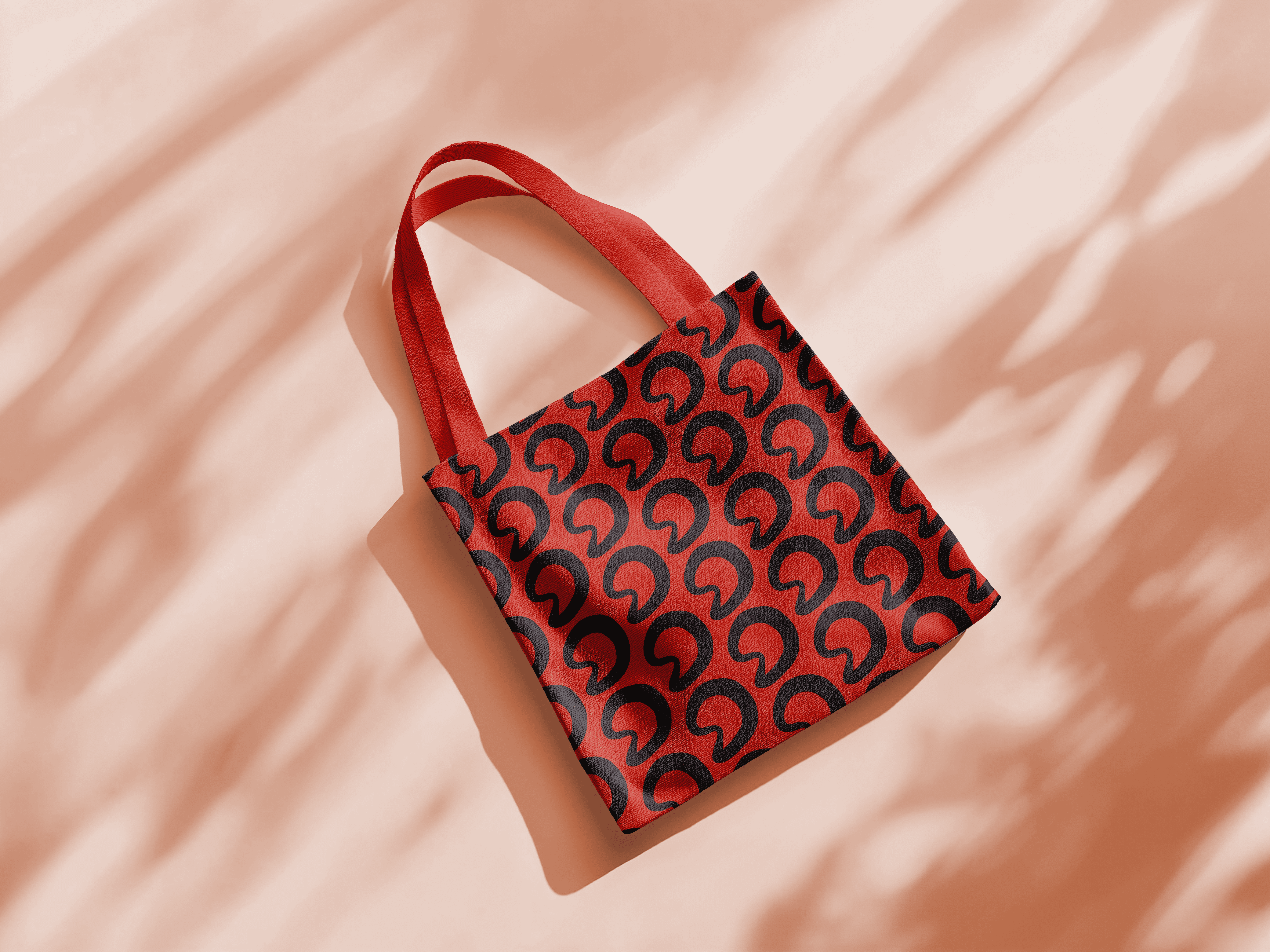
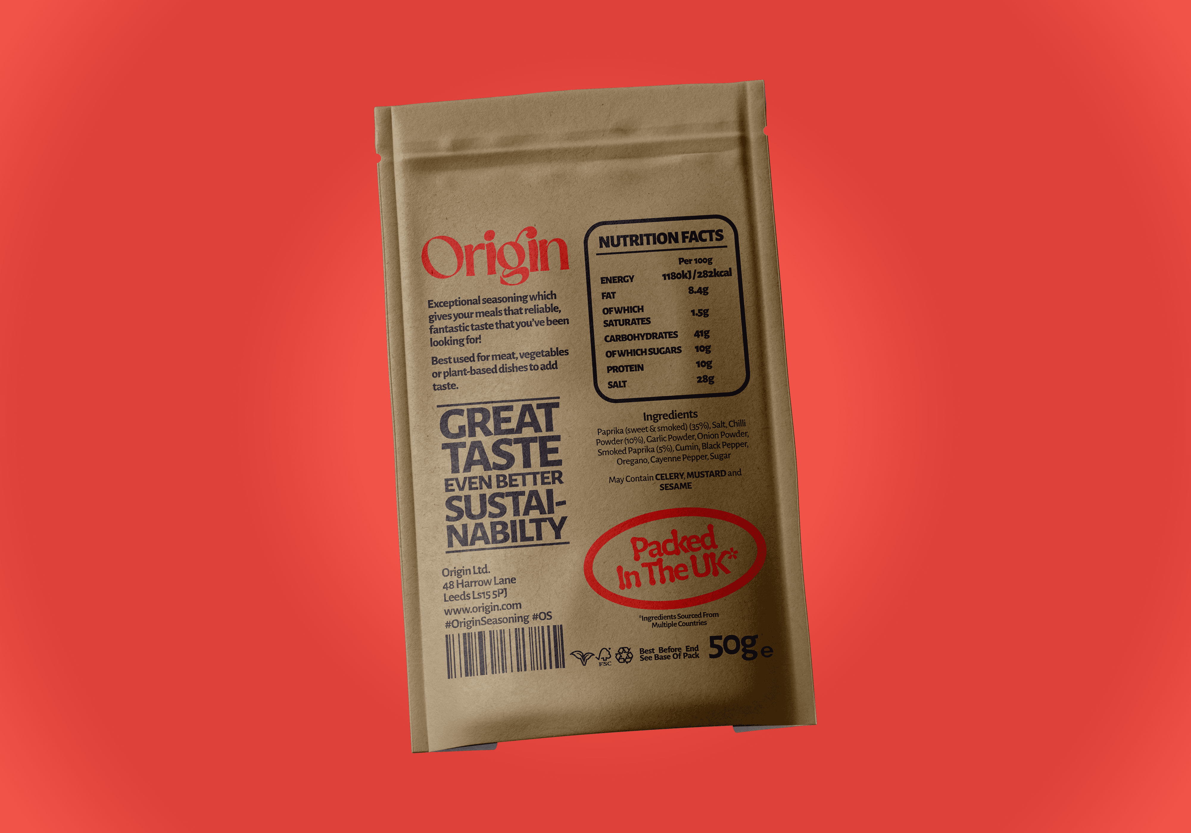
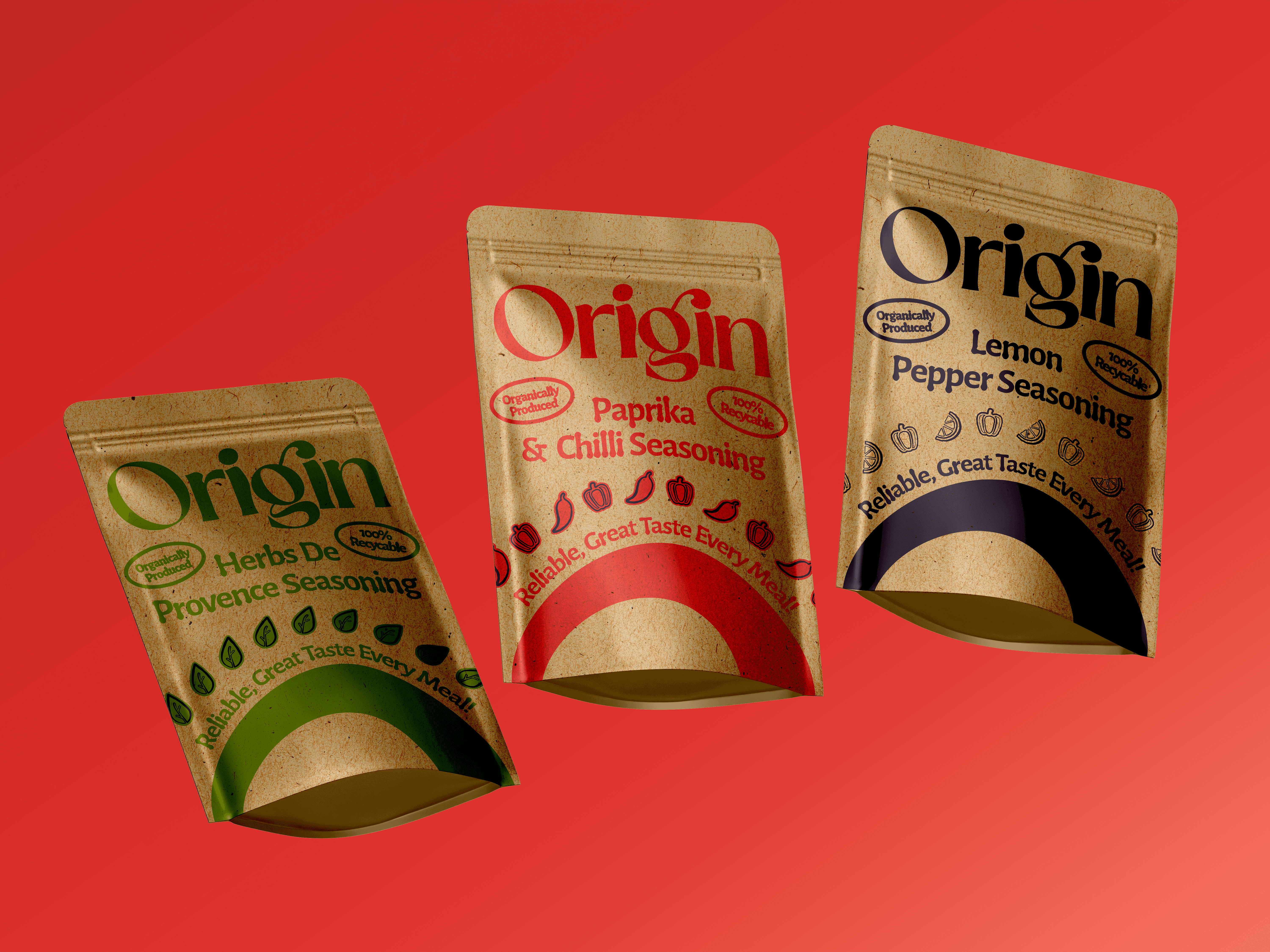
The identity was developed around the idea of returning to the origin of flavour - the natural ingredients that create every dish. The brand system uses kraft paper packaging and organic, imperfect details to create a more authentic and natural feel, helping Origin stand apart from more polished and artificial competitors.


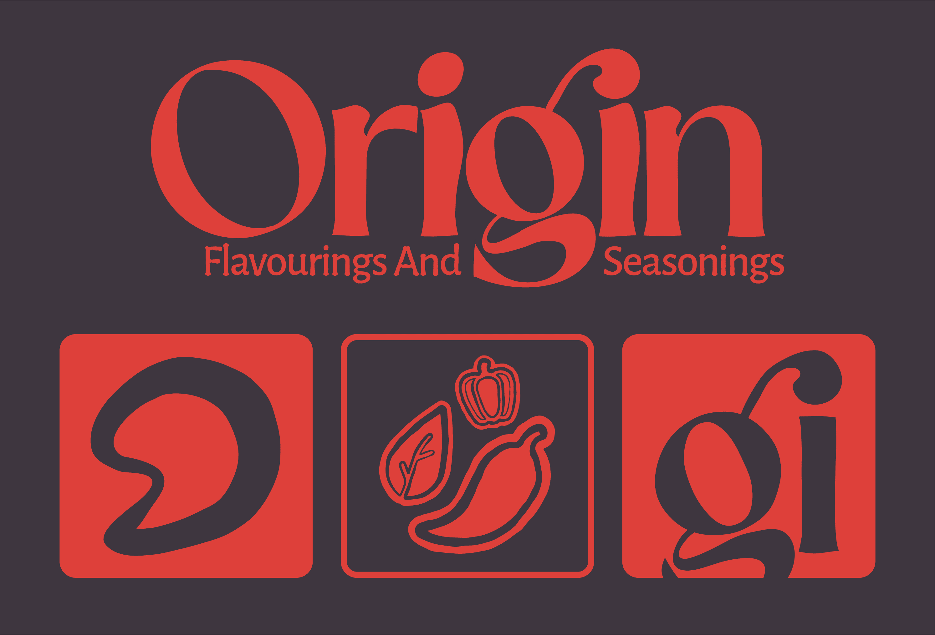
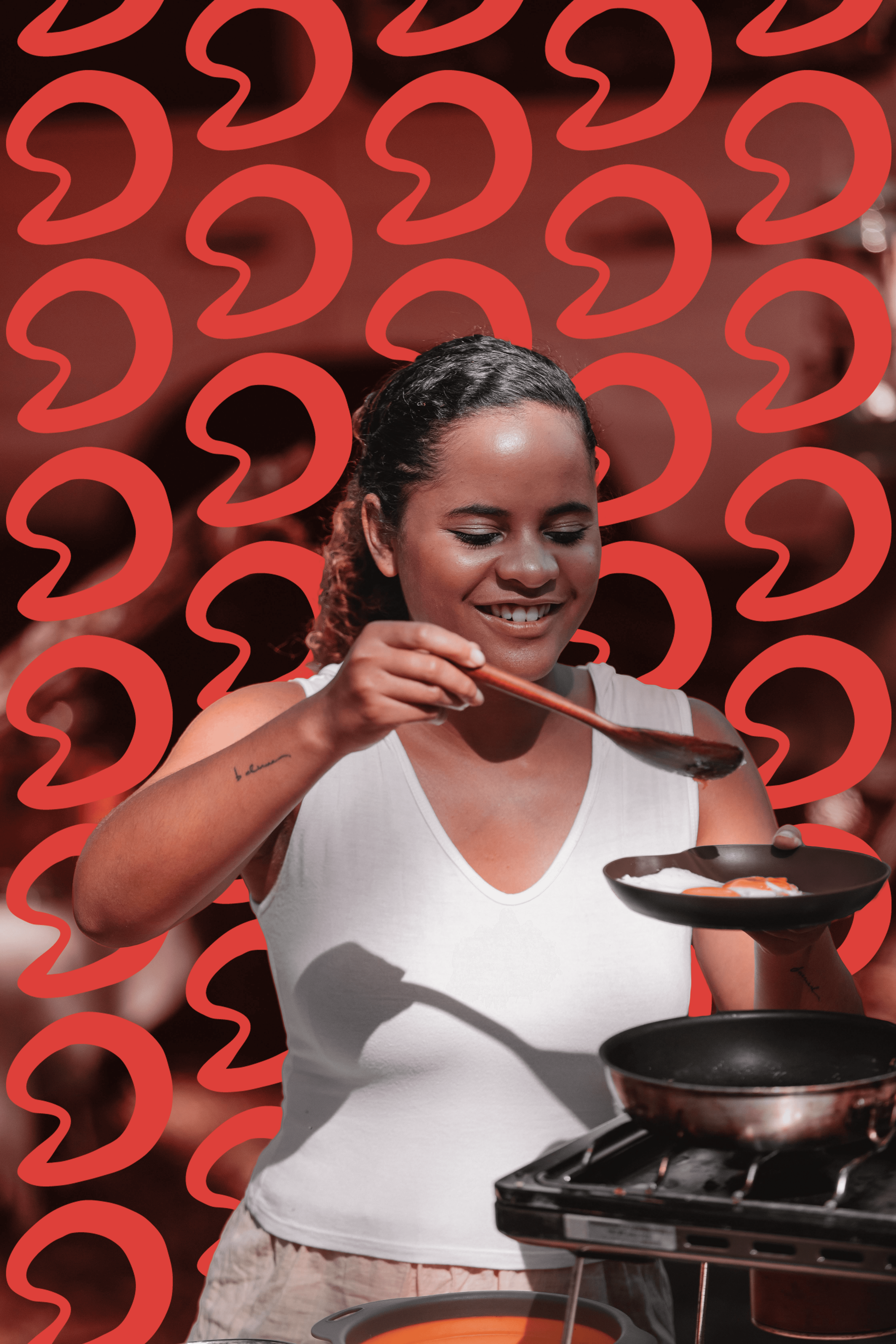
The logomark takes inspiration from a seed, representing the beginning of every ingredient and the brand’s commitment to sourcing from trusted and respected places. This symbol was integrated throughout the identity, including within the typography where the seed shape becomes the dot of the ‘i’, creating a consistent and recognisable brand detail across the packaging.


Cinnabar was selected as the main colour to evoke warmth, energy and appetite appeal, and helps key elements stand out - creating contrast without overwhelming the brand. While the darker, earthier tones communicate quality and authenticity.

Deliverables:

Deliverables:

Deliverables:

Branding

Brand Strategy

Logo Design

Packaging Design

Art Direction

Copywriting

Year

/

2026

Client

/

Origin

Next work