AMP
Intro
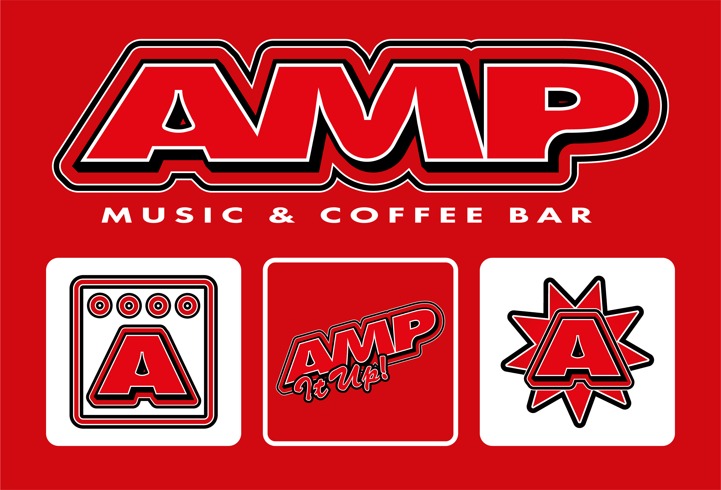
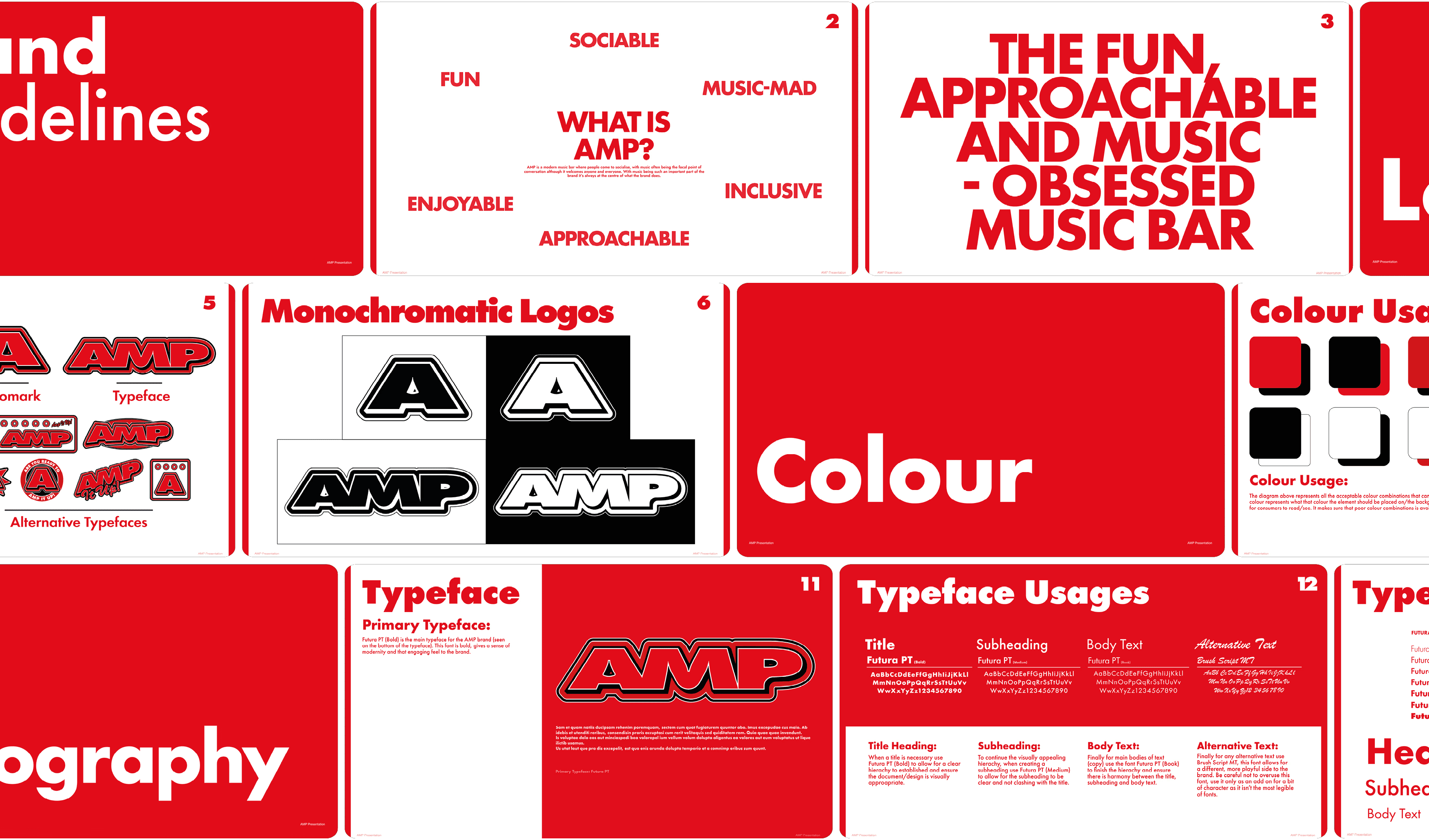
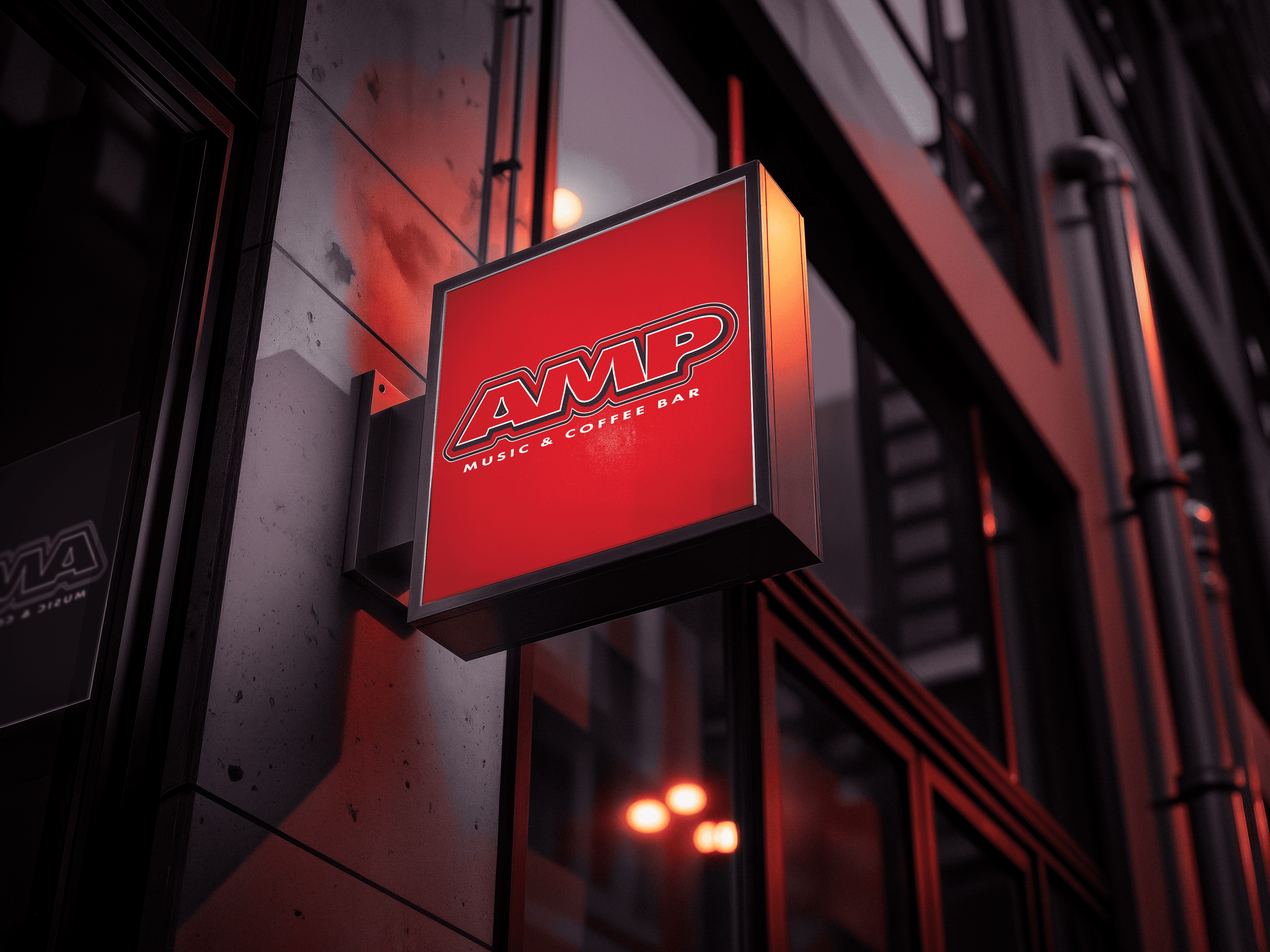
AMP is a fictional music-oriented bar which was developed into a branding project from a brief I was given. The brief asked for a more experimental design and avoid using flat designs. The identity draws inspiration from the 2000’s and 1990’s which, in my opinion, is the golden era of modern music. The colour palette revolved around the colour red which envokes potential customers to feel a passion and a desire to enjoy and talk about music within the bar.
Year
/
2025
Client
/
AMP